Holy Child Academy
Art Direction, Graphic Design, Production
Deliverables:
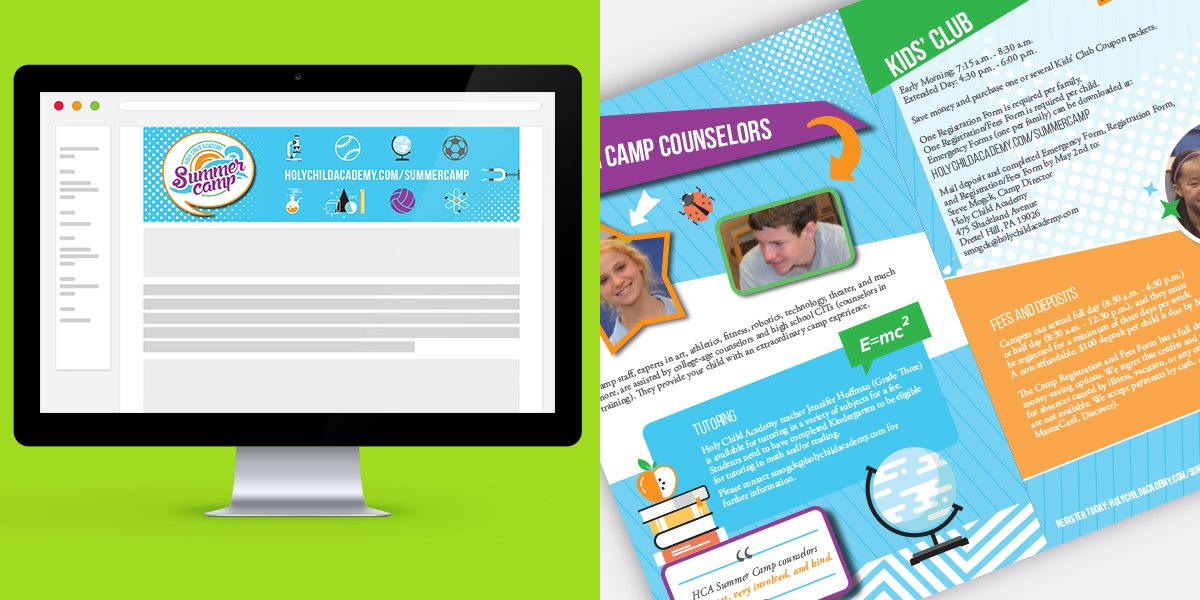
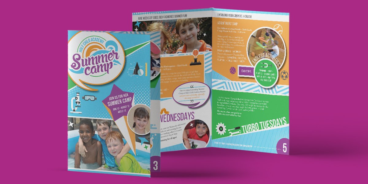
BROCHURE / SIGNAGE / EMAIL
Objective:
Update the summer camp brochure with new information and infuse new brand elements into overall design.
Inside info:
The client wanted to refresh their summer camp brochure. Typically a conservative approach, I wanted to push them a little…well, ok, a lot. I knew these would be lying on kitchen tables in a pile of other local summer camp brochures. These needed to pop! Bright colors, crazy patterns, happy children. The goal was for the children to see these amongst the others and beg their parents to take them there because it looked fun.
Outcome:
Success! The client immediately understood the new direction and sparked a rejuvenated excitement for the upcoming marketing and enrollment period.