Levering Mill Tribute House
Art Direction, Graphic Design
Deliverables:
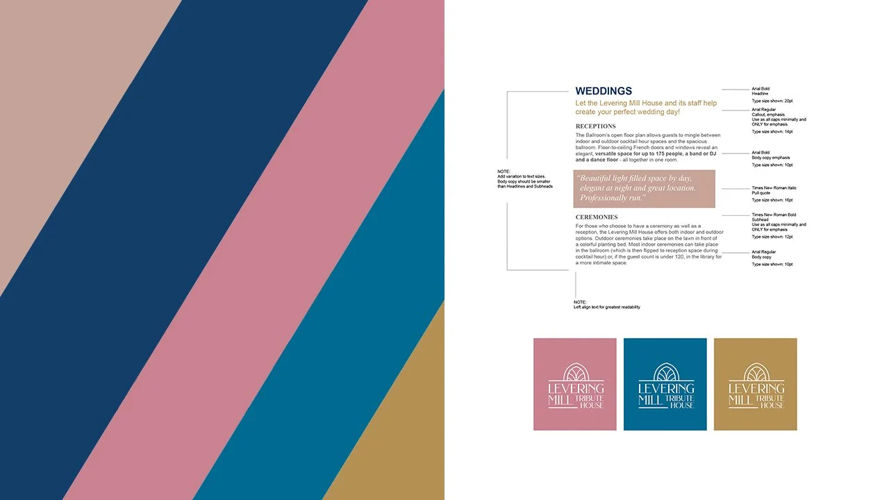
BRANDING GUIDELINES / LOGO DESIGN
Objective:
Create a branding system for a revitalized historic event space and have it appeal to young couples seeking their wedding venue.
Outcome:
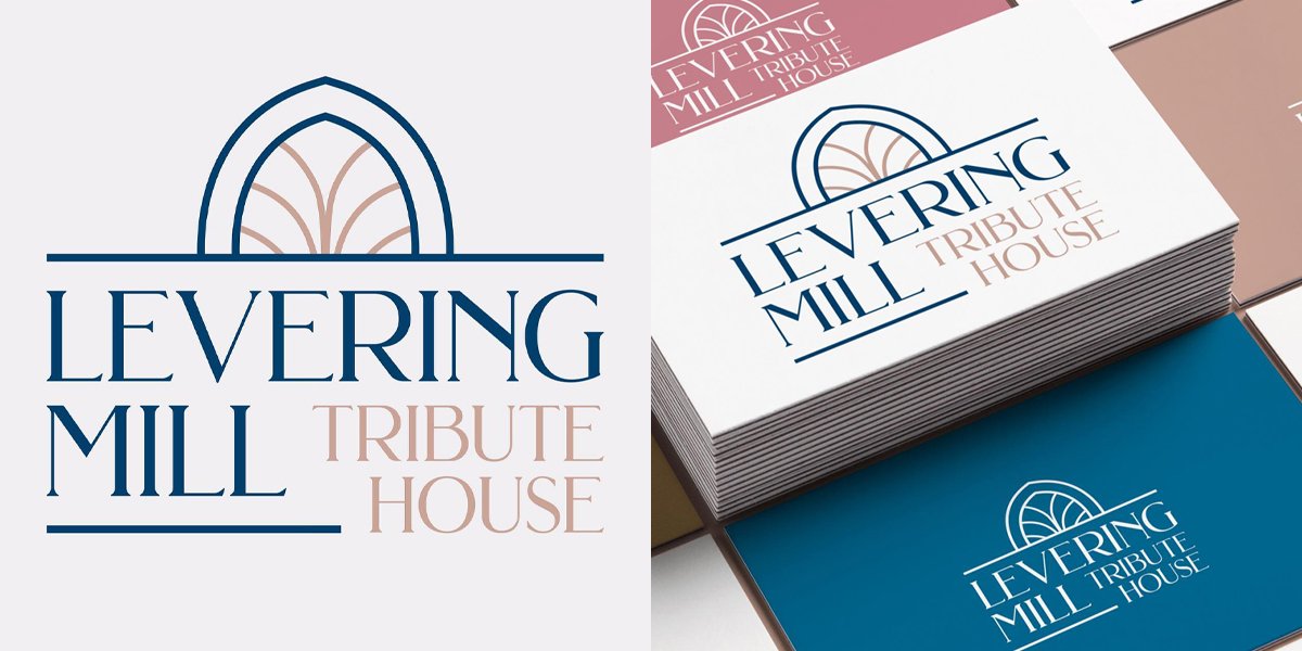
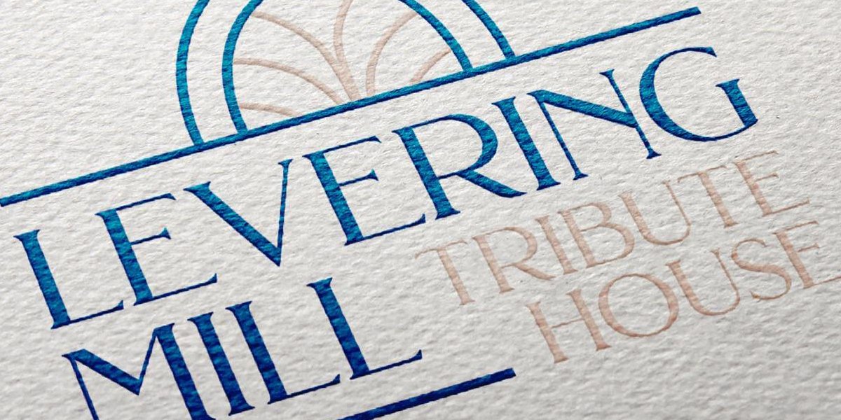
Taking inspiration from the architecture, the new logo mark is modeled after a window atop the face of the building. The new color palette feels modern, soft, and sophisticated matching today’s bride and groom. While the use of Times New Roman sounds antiquated, it was chosen for its stroke weight balance and easy to read italics. Pairing with Arial as the headline adds modernity. The use of Arial and Times New Roman also allow for the staff to easily create internal branded communications.
Together, this identity ties well with their sister venue, Merion Tribute House, making joint communications seamless.